The Auburn School District
Family Access Website UX Project
Roles
Group Project
UX Research, Wireframing & Prototyping, UI Design
Team Members
Jessie
Minyoon
Tools
Sketch, Adobe XD, Photoshop, Illustrator, Google Forms, Google Docs, Miro, Asana, Whiteboard, Post-it notes and butcher paper
Problem
Functionality: What busy parent wants to spend endless hours hunting for important academic information about their child? Weeding through endless announcements and navigating through busy sites is frustrating. After searching only to find that the information they are looking for is not available online? This is the situation for parents of the Auburn School District. With all the noise, the Family Access page is difficult to navigate and is missing critical features.
Solution
We managed to take a very busy website and simplify it to the basic needs of the parents. The features include excusing absences, making payments, reviewing educational plans and updating family information. With this website reorganized it will make it possible for parents to access the information they need.
Research
Interviews & Survey
We started our journey on this project by conducting interviews with parents in the Auburn School District.
Then we sent out an online survey to the greater masses. It contained a list of tasks they wish to accomplish. These included; checking grades, looking up payments for trips, authorizing athletic forms, excusing absence, contacting instructors and reviewing IEP and 504 plans. The results showed that most parents cared about excusing absences, checking grades and making payments.
Analysis
Personas
Website Review
User Journey Map
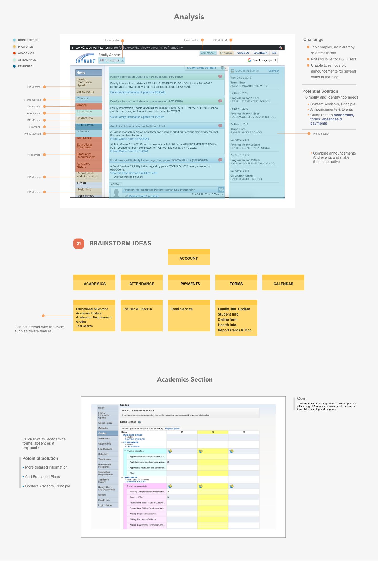
Family Access Website Review: With this information in mind we went ahead and reviewed the existing website to see how each parent would accomplish these three tasks. We discovered that academics alone was in seven different locations. The Attendance page was a view only function The Payments page is managed by a third party with no link back to the Family Access page. When we tried to get more information from the footer, we had to scroll down past the announcement that went on for the past two years only to find to our disappointment, no footer.
Personas
Website Review
Brainstorming


Prototype
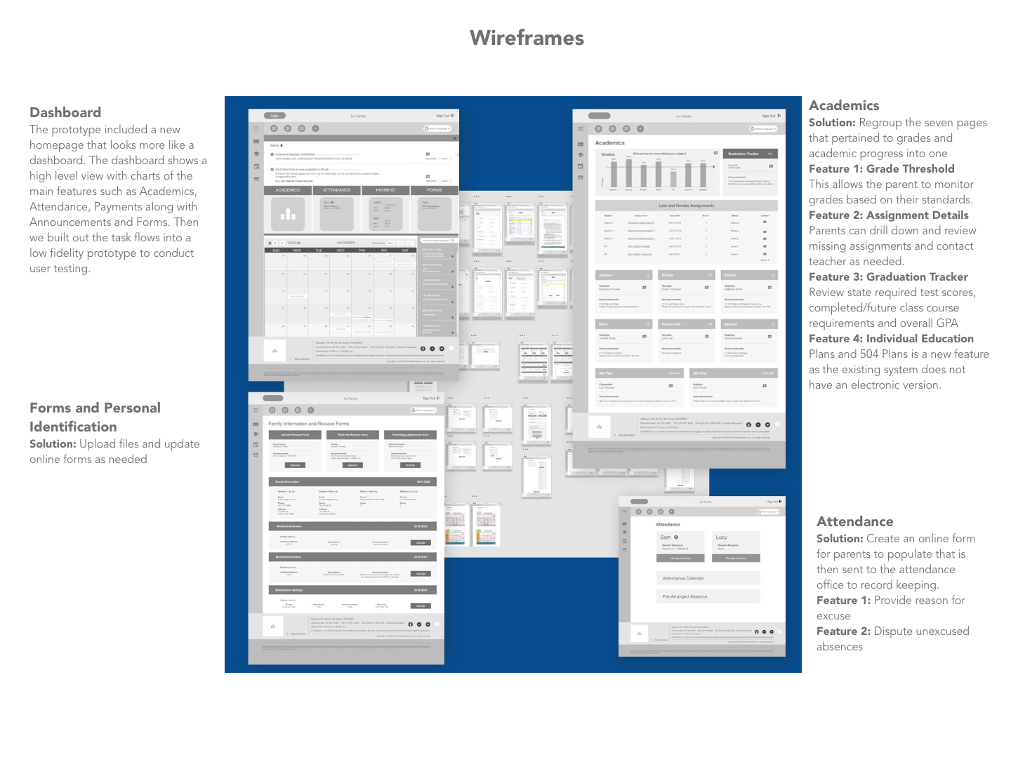
The prototype included a new homepage that looks more like a dashboard. The dashboard shows a high level view with charts of the main features such as Academics, Attendance, Payments along with Announcements and Forms. Then we built out the task flows into a low fidelity prototype to conduct user testing.
System Flow Chart
User Testing
We had six different parents run a series of tasks through the prototype on their computer.
Task 1: Academics
Missing Math Assignment; Look up the details for a missing math assignment.
Task 2: Attendance
Excuse an unexcused absence
Task 3: Payments
Add more money to Sam’s lunch fund.
User Findings
We found that some navigational norms were missing the help the parent move from one page to the next. These included back buttons and tabs to other pages. It was not clear where to click on some of the screens. With this in mind we made changes to the prototype for the final wireframe iteration.
High Fidelity Website
Once we created the high-fidelity pages, we found that our color choice of a blue was lending more towards a medical page, thus we revisited the site with a warmer more friendly color pallet choice. Based on feedback we adopted the government style guide to our next iteration and changed the look and feel of the icons and boxes.
Reflections and Next Steps
The next steps would be to work with the school district and conduct a beta test with a small group of parents with the new website. After the beta testing then we would partner with the schools and create a pop for open houses that would provide resources for on-boarding parents to the new site.


