PLUIE
Group Project UX and Branding
Overview
Team
Jessie
Min
Tools
XD, Illustrator, Photoshop, Miro
Problem
Inclusivity: In today’s world most body products are geared towards one gender or the other. Very few are neutral. Many are annoyed with the societal constructs of gender. Men want soft hair without the smell and women are tired of paying the pink tax. There needs to be a neutral ground for body products. What does this look like? What does it smell like? How can this be competitive in today's market?
Solution
The PLUIE Company provides a subscription model for gender-neutral products that are affordable and sustainable. The subscription includes shampoo, conditioner, body wash/foams and lotion in its starter kit. The scent is linen scented or unscented and the design minimalistic.
Research
“It's a myth that men’s skin is any less sensitive or less prone to wrinkling as compared to women’s”
Survey.
We conducted a survey based on our research to decide on what to market and how to market it.
Demographic:
We found in our research and survey that Z generation is the most open to gender neutral products and the subscription model.
Product:
The top 5 products were shampoo, conditioner, body wash, face cleanser and lotion. 49% are concerned about the product's benefits to the body and if the ingredients are organic and sustainable. We decided on a fresh clean scent similar to clean clothes.
Subscription Model:
The packaging is minimalistic and follows the resilient packaging model with the choice to recycle as 55% or our survey prefers to recycle. The subscription model needs to be flexible and under $30 dollars to stay competitive.
Something about the competitive analysis here
Approach
Personas
Pivot Points
Challenge: Originally we had 5 scents to choose from. This made the subscription model too complicated.
Solution: We reduced it down to scented and unscented.
Challenge: We went with a dark glass for resilient packaging, but this would be costly to send and receive.
Solution: Recyclable plastic that can be returned for a refund or recycled.
Brainstorm
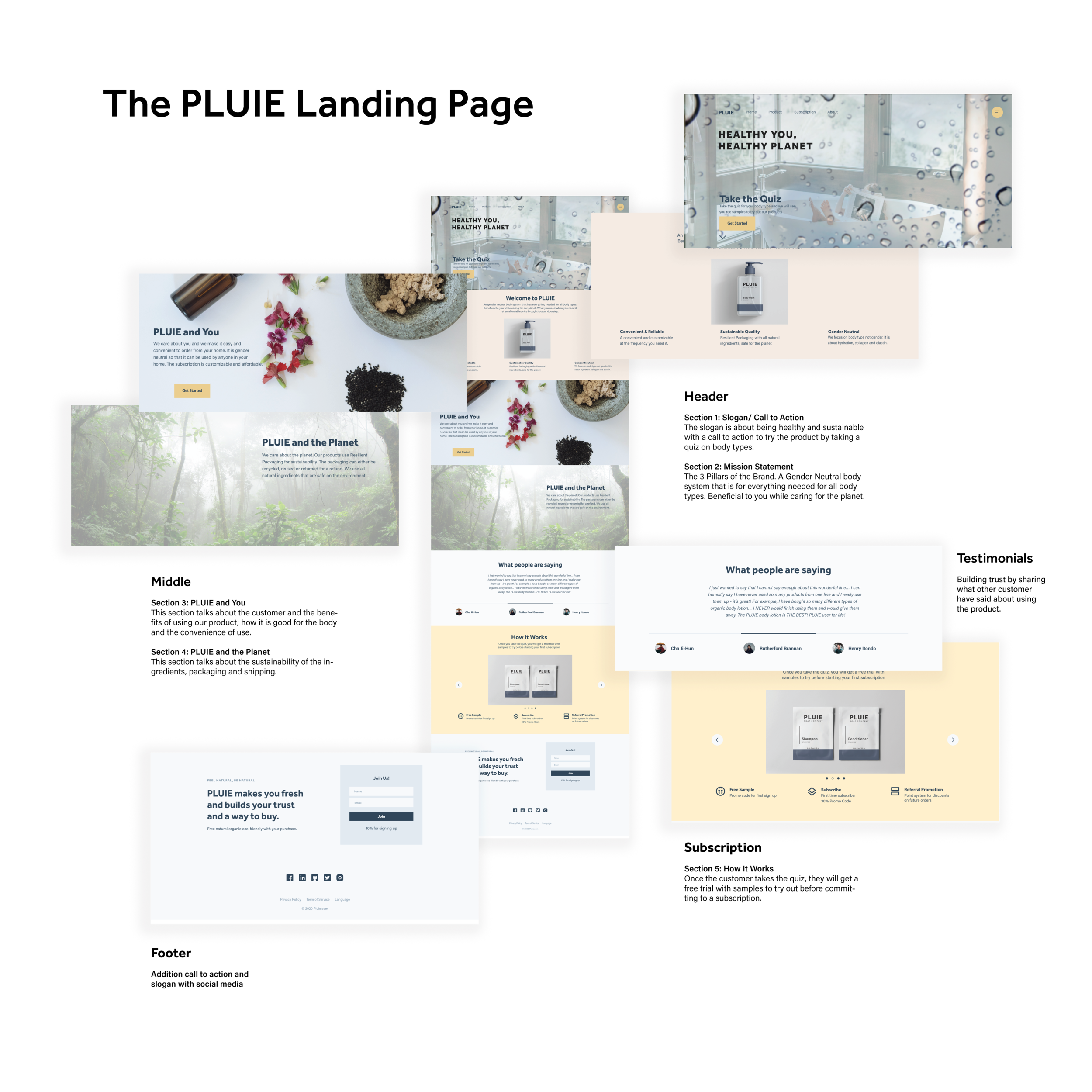
With our demographic and product line selected based on the research, we went ahead and started brainstorming what the subscription model would look like. We decided that taking a quiz and receiving samples to try the product would be a great way to promote the product based on the reviews that people are worried about whether they will like it or not. Then they can sign up for what they want to come and when.
Subscription Flowchart
It all begins with an idea. Maybe you want to launch a business. Maybe you want to turn a hobby into something more. Or maybe you have a creative project to share with the world. Whatever it is, the way you tell your story online can make all the difference.
Branding
Mission Statement
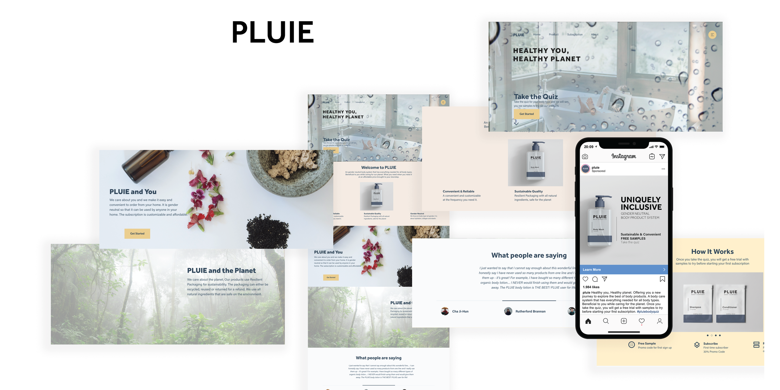
Welcome to PLUIE. A gender-neutral body system that has everything needed for all body types. Beneficial to you while caring for our planet. What you need when you need it at an affordable price brought to your doorstep.
Visual Direction
The name PLUIE is French for the word rain. Hence the branding is clean, fresh and minimalistic. The colors represent the rain and sunshine. Like nature after rain and the sun comes out and everything is bright and renewed. Graphics are simple lines and typography is the show piece for PLUIE.
Clean and minimal, the packaging is made from recycled plastic that can be reused.


